uOttaHack 2020
Role - Designer
Responsibilities - Redesign brand, logo, website and merch
Project Length - 8 months
Team Members - 2 Designers: Munir Aljawahari & Alistair McCarten

Context
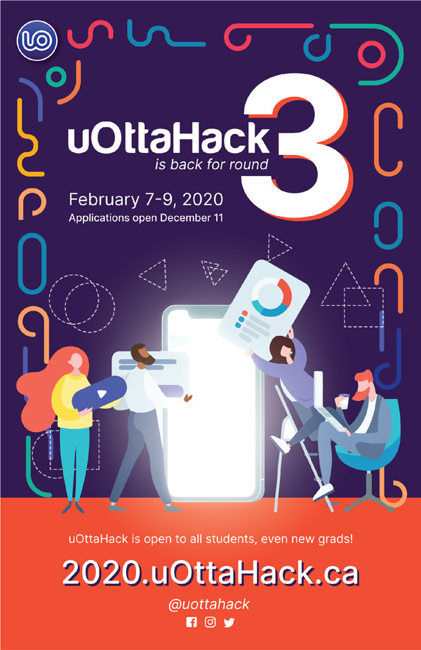
uOttaHack is the University of Ottawa's largest ever hackathon, hosted for students of all studies across Canada. This year, uOttaHack 3 welcomed over 400 students from February 7th-9th to collaborate on projects, learn at workshops, and develop their innovative ideas. This year, the uOttaHack committee decided to launch a rebrand that will represent this special uOttaHack and continue to represent the face of uOttaHack for years to come.
Previous Design
In 2018, uOttaHack's design revolved around the blue circular logo. In 2019, uOttaHack adopted the isometric illustration theme to appeal to sponsors and hackers. This year, we wanted to give uOttaHack a new logo and theme that would sustain through trends but can also slightly change year to year.

Design Process
I started by analysing symbols that represent the University of Ottawa, followed by researching for logos that revolved around the letter U.


After many iterations, these were the logos that were considered, but were later scrapped.

Final Design & Styleguide
After much debate and iterations, the following final design was created:


Purple was chosen as the base color to allow orange and beige to provide contrast. The shades of blue were used to transition between the purple and the orange.
To occupy the background and contribute to the playful mood we used libraries such as paaatterns, humaaans and whooosh. These libraries were critical when making various social media posts as they allowed us to convey messages while keeping a design theme.


Website Design
The goal was to showcase the rebrand of the hackathon while enticing students and sponsors to participate


Graphics & Merch
These are some of the social media & graphical assets that were made and shared on social media platforms.


Takeaways
I learned that a rebrand is a lot easier said than done. I underestimated how much time it would take to recreate a design style guide.
However, spending time on the design style guide proved to be useful as it allowed my partner to recreate assets in the same vision. Although I was only working with one other designer, the style guide prevented discrepancies in the design, and made it easier to convey the theme to other associates My next goal is to design within a larger team to expand my design workflow knowledge.